Recently I was in an apartment that had a variety of maps as décor covering the walls. The maps were in the kitchen, the living room, the bedroom and the makeshift hallway.
We started talking about the idea of space (as in the space between countries) and the relation of people to this space, politically, socially and personally. I’ve always been fascinated by maps, and the way in which people express their external surroundings and the way in which countries position themselves on a map.
It amazes me that this map can exist, with somewhat surprising accuracy, considering there was no ‘objective’ at the time, (hey, they thought the Earth was flat). I also love the fact that N. America & Antarctica represent such an incredibly large land mass. As if being unknown is equal to a larger size size and significance.

Click to enlarge
Aussie "Upside down" Map- I love the fact that Australia orients themselves this way.

And, one of my favorites, The Peter's Map: This is an area accurate representation...which really stirred up scholars back in the 70's. It used cylindric equal-area to show one way in which the world is proportionally measured. Africa you are huge:

Africa-in proper size proportion to other countries:

It always amazes me that the size of W. Europe and N.America is so incredibly small.
Postcolonial Trade Map-Because after seeing Africa, you realize power is not all about size...
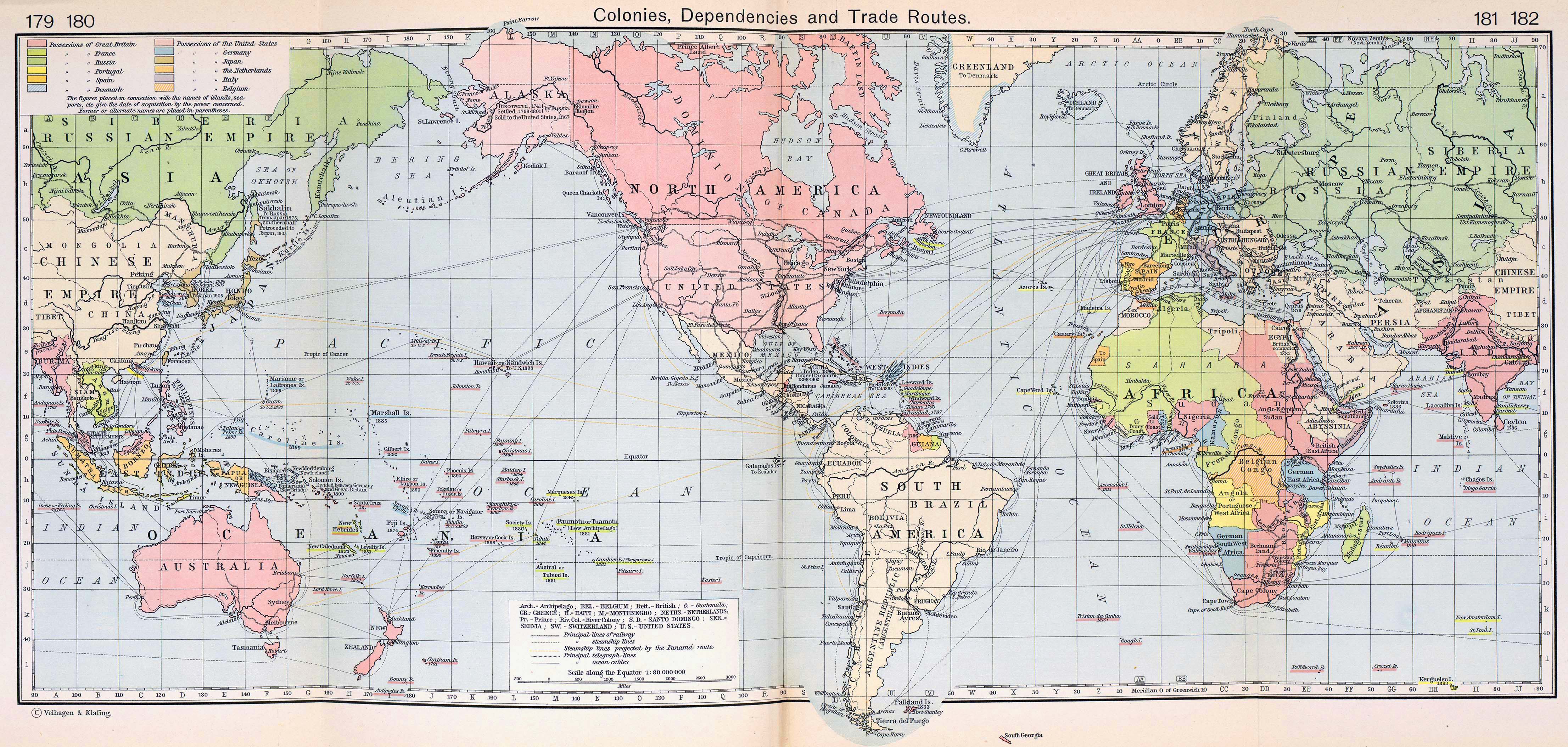
Click to enlarge!
And, perhaps the most commonly used Map: Mercator. Just note how the map is centered around N. America.

These are all maps representing the same thing, it just is so surprising how something so 'objective' (as in, there is only one earth to show) can take a variety of forms.
No comments:
Post a Comment